A CTA Button (call-to-action) is essential for the health of your business.
A call-to-action is intended to drive the user to a specific action, to complete a conversion. This conversion can be many things, such as signing up to a newsletter, buying an product or redirecting the user to the paid area of the site.
A good call-to-action meets certain requirements, including these:
- The text should demand a specific action from the user.
- The button should be highly visible. Some colors perform better than others. I've seen that green and orange perform often better than other colors.
- The text inside the button should be no longer than 5 words.
In this tutorial, we are going to create a CTA button in the Gutenberg editor. Keep reading to learn how!
Video guide to buttons in Gutenberg
Step #1. Install the PublishPress Blocks plugin
First, we're going to install a plugin that has the block we need for this tutorial.
- Click Plugins > Add New.
- Type PublishPress Blocks in the search box.
- Click Install Now.
- Click Activate.
Step #2. Create a post
Now let's create a new post to test the PublishPress Blocks plugin:
- Click Posts > Add New.
- Write a proper title.
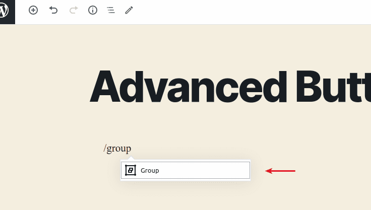
- Click the “+” icon to insert a block after the title or hit the “/” key.
- Search and select the Group block.
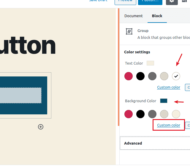
- Change the Background and text colors of the group on the right.
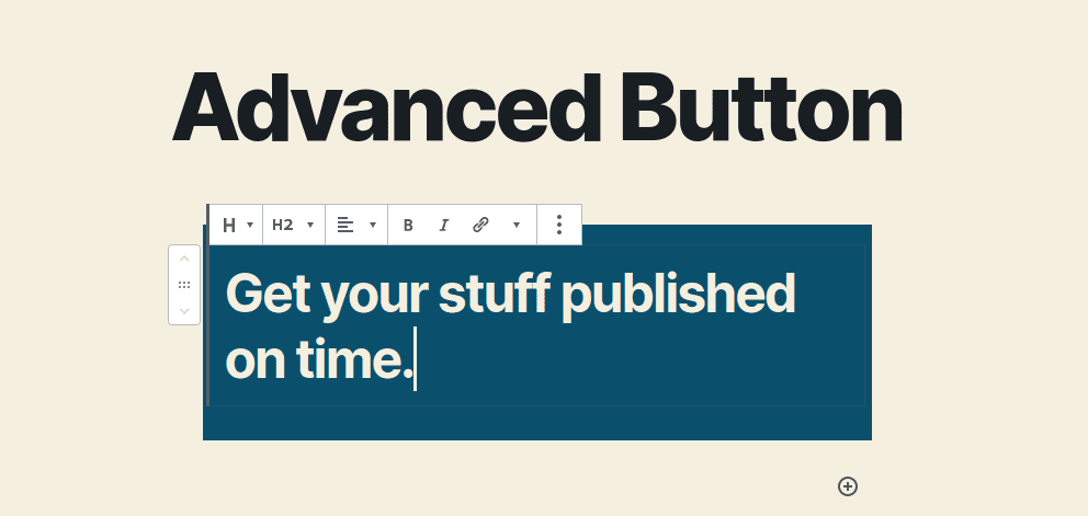
- Click the “+” symbol inside the group and add a Heading 2 with “attractive” text, inciting the user to take an action.
Step #3. The PublishPress Blocks button
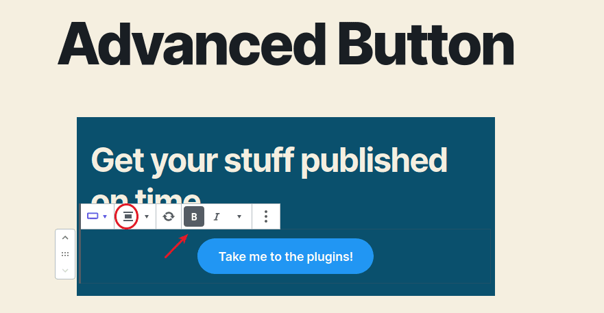
In this step, we'll create a block using the Advanced Button option:
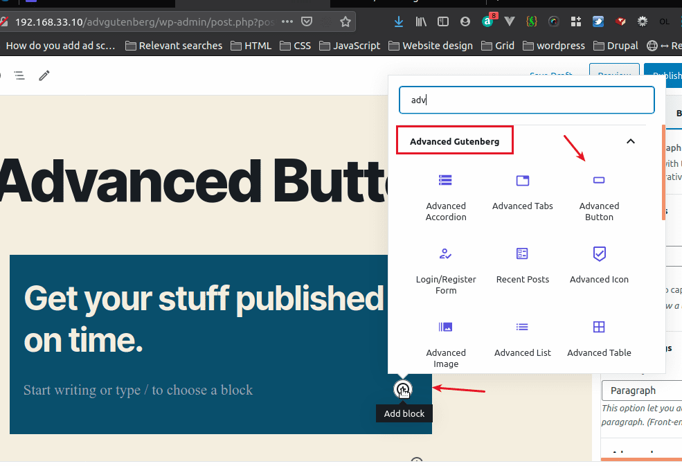
- Add a block below the heading and select “Advanced Button”.
- Change the button text.
- Select the text and make it bold.
- Center the button.
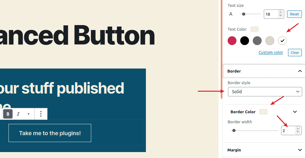
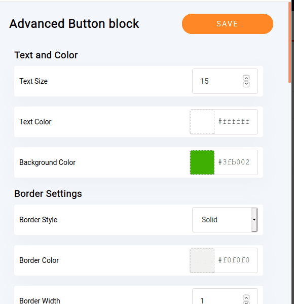
Let’s take a look at the configuration options provided by the plugin for this particular button.
- Click the styles tab on the right column.
- Change the default button style to Squared outline.
Notice that you can override the default style for this particular button here.
- Add a proper link.
- Change the text color to a brighter one.
- Select a solid border with a width of 2px.
- Select the same bright color for this border.
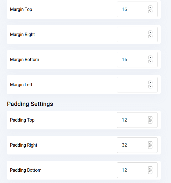
- Add 2 more pixels padding everywhere (12px, 32px).
- Leave the hover styles untouched.
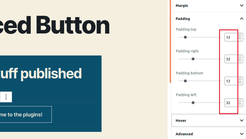
- Click Publish two times.
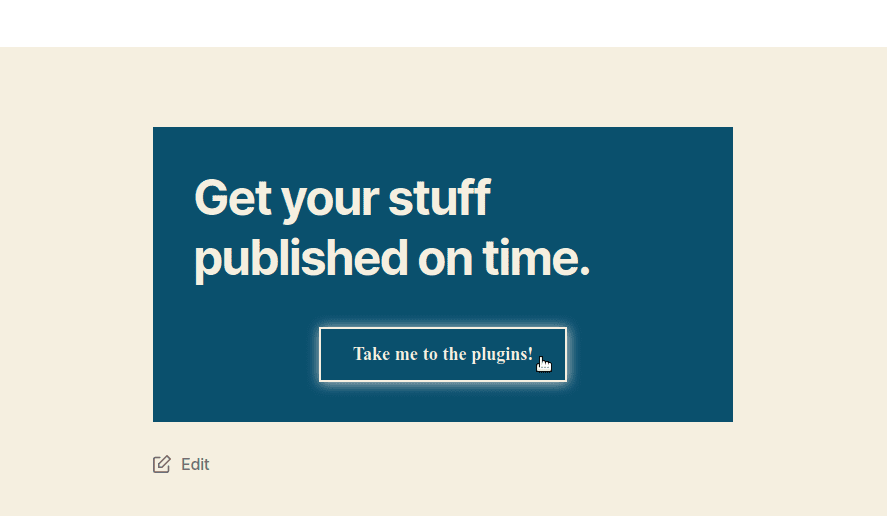
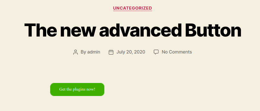
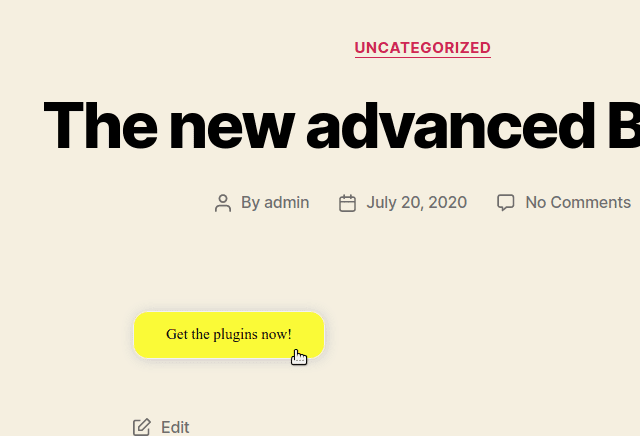
Now you have an elegant and nicely designed button for your site and it just took a couple clicks. Let’s take a look at the default options.
Step #4. The Advanced Button default options
These settings can apply to all the buttons on your site:
- Click PublishPress Blocks > Default Blocks Config.
- Click the cogwheel beside Advanced Button.
- Enter your own values, just play around with the options until you think your button looks nice.
- Click Save to record the changes.
- Close the overlay window.
- Create a post and add an Advanced Button.
- Change the button text.
- Click Publish two times.
- Click View Post.
Take a look at your customized button. This is useful if you want your buttons to look the same all across the web site.
If you liked this feature, you find enjoy other PublishPress Blocks features including the accordion block, image slider block, testimonials display and count up block. If you want layouts, there's a Columns Manager to build your pages. You can also add lightboxes to galleries and videos.
I hope you liked this tutorial and enjoy using PublishPress Blocks. Thanks for reading!